
Draftsim
Two weeks. One MTG set launch deadline. Zero prior knowledge of Magic: The Gathering.
- Work
- Design SystemDesign directionUser InterfaceVisual Design
- Tools


Draftsim is one of the most used MTG draft simulators on the internet, a tool that lets Magic players practice drafting decks against AI opponents before playing in real tournaments.
The product had an existing codebase and a loyal user base, but the interface hadn't been redesigned in years. The team at Turn Sideways Media brought me in to redesign the core product experience from the ground up.

THE BEGINNING
The referral came from the MetricWorks CTO, someone who had seen me design across enterprise product and game development. He introduced me to the team at Turn Sideways Media because of both backgrounds. Draftsim sits exactly at that intersection.
The constraint was immediate. The new set, Secrets of Strixhaven, was launching soon.
The redesign had to be approved and ready before that window opened. Two weeks to research, design, and deliver a complete Phase 1 across 5 core screens, a component library, and a full design token system.
I had never played Magic: The Gathering.
THE PROCESS
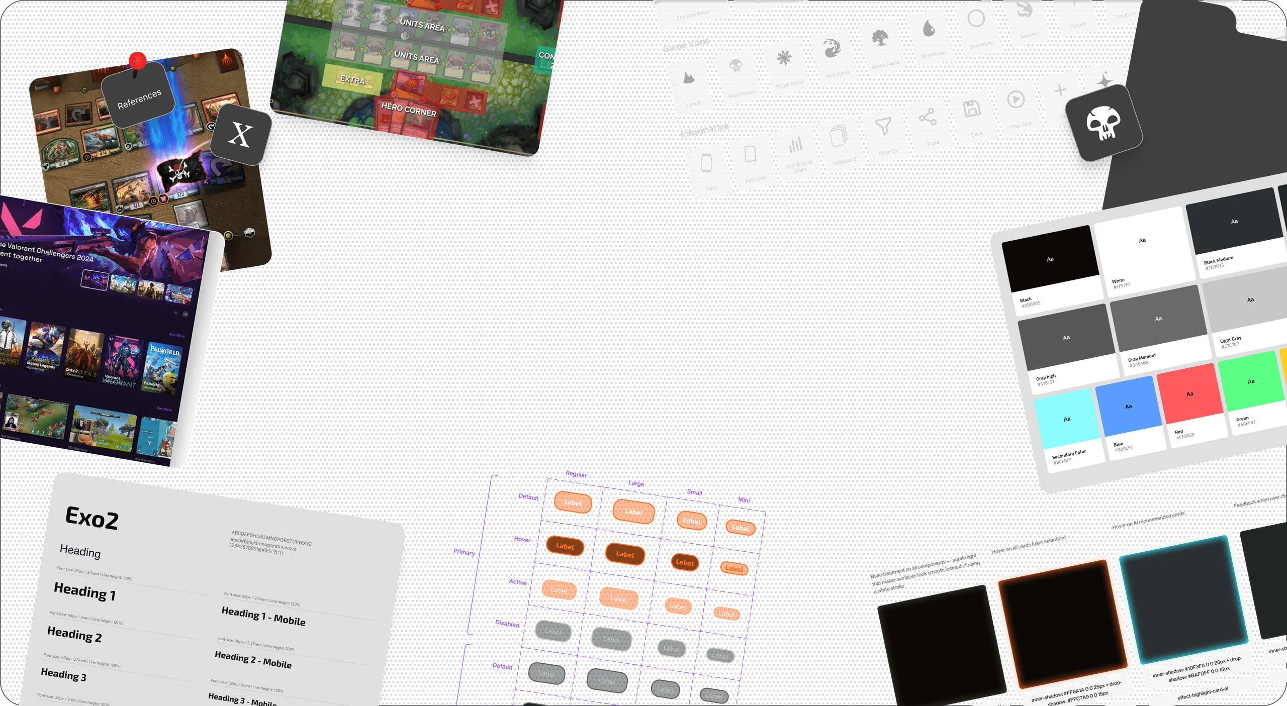
With two weeks on the clock, there was no time to learn on the job. The first few days were entirely research, how drafting works, what CMC means, how mana colors drive deck strategy, what BREAD theory is, how AI recommendations influence picks.
I used competitor analysis of the official MTG video game, and hours of gameplay footage to compress months of domain knowledge into days.
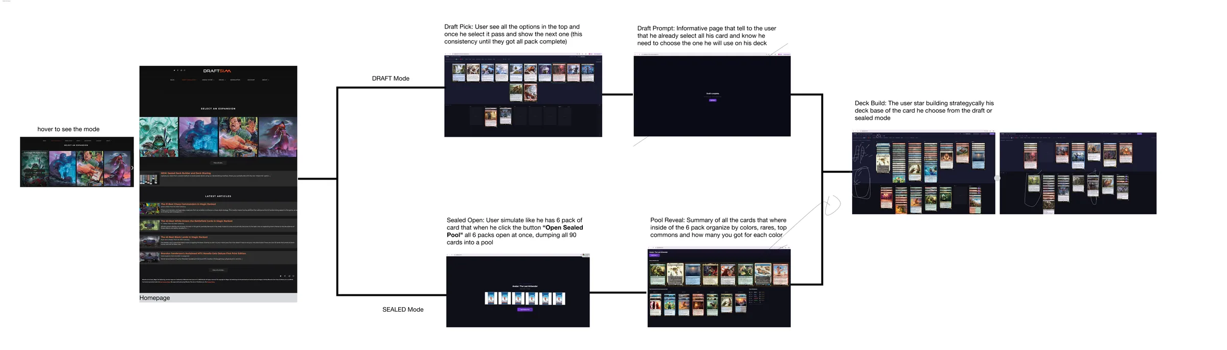
Two specific decisions came directly from that research and saved the most time:
Pool Reveal merged into Deck Builder. Separate screens created unnecessary friction for a user who just wants to start building. One screen.
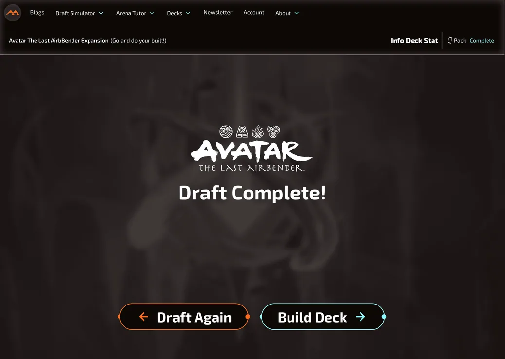
Draft Complete removed. A summary screen between drafting and building added a step with no real decision. Cut it.
The system was delivered on time.
Secrets of Strixhaven launched with the new interface live.
THE WORK
Three key flows. Each one informed by domain knowledge.
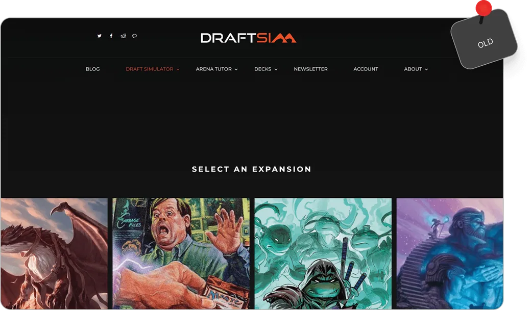
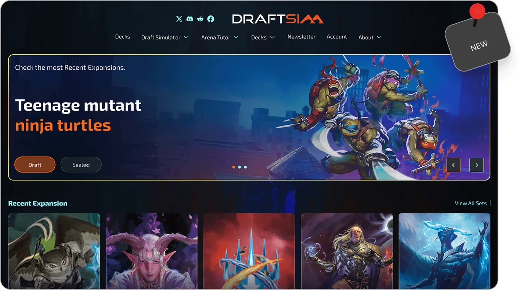
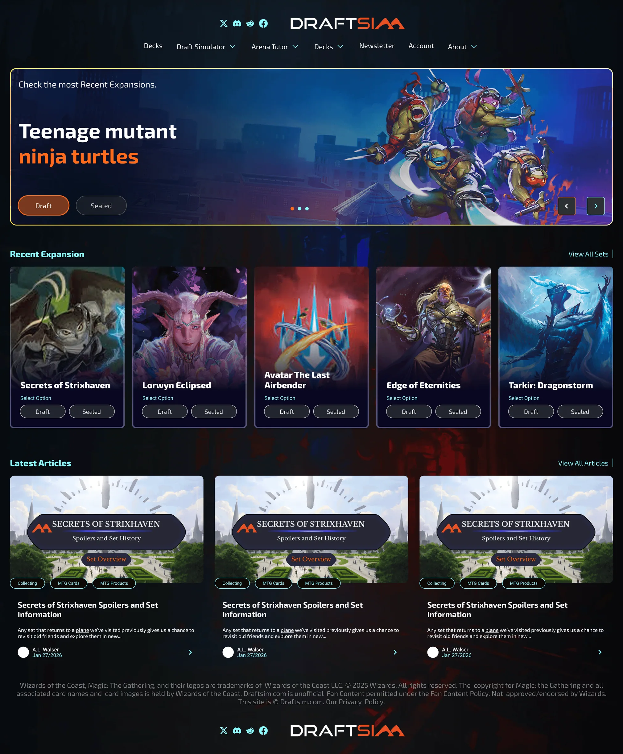
Homepage
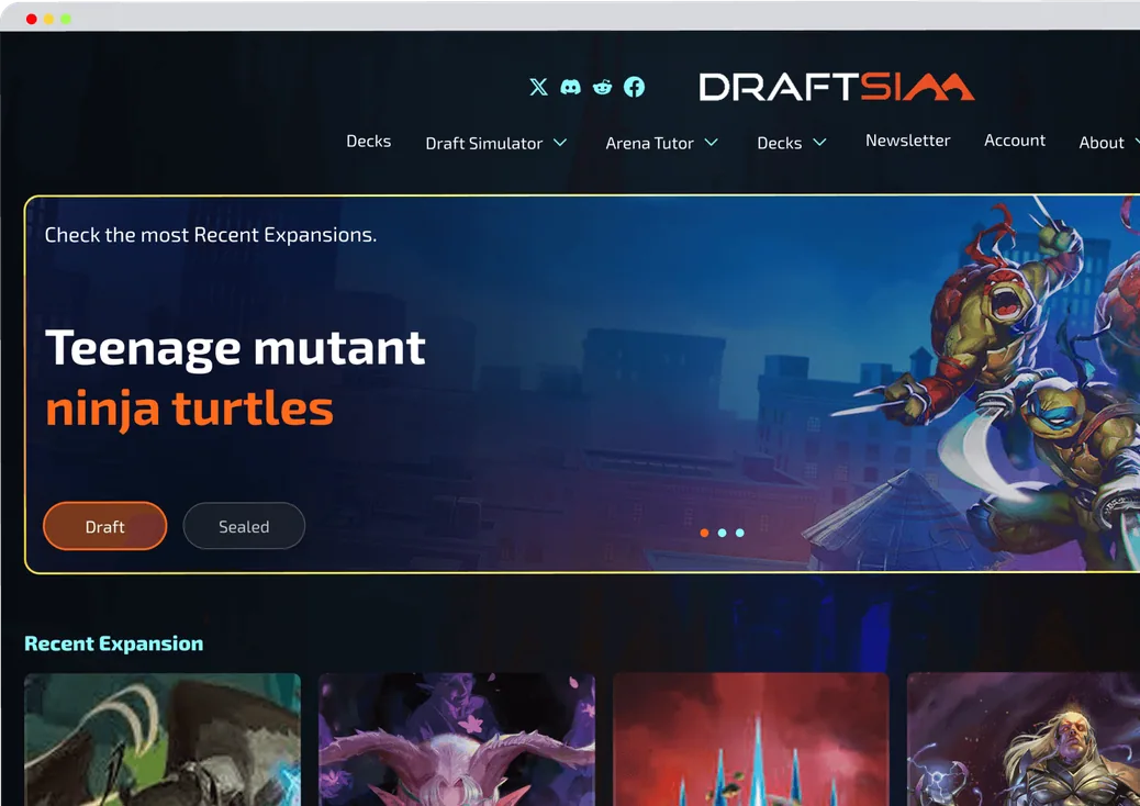
The entry point for every user, seasoned player and first-timer alike. The redesign had to communicate what the product does immediately, surface the right calls to action, and work on mobile without losing the density that experienced players expect.

Draft Mode
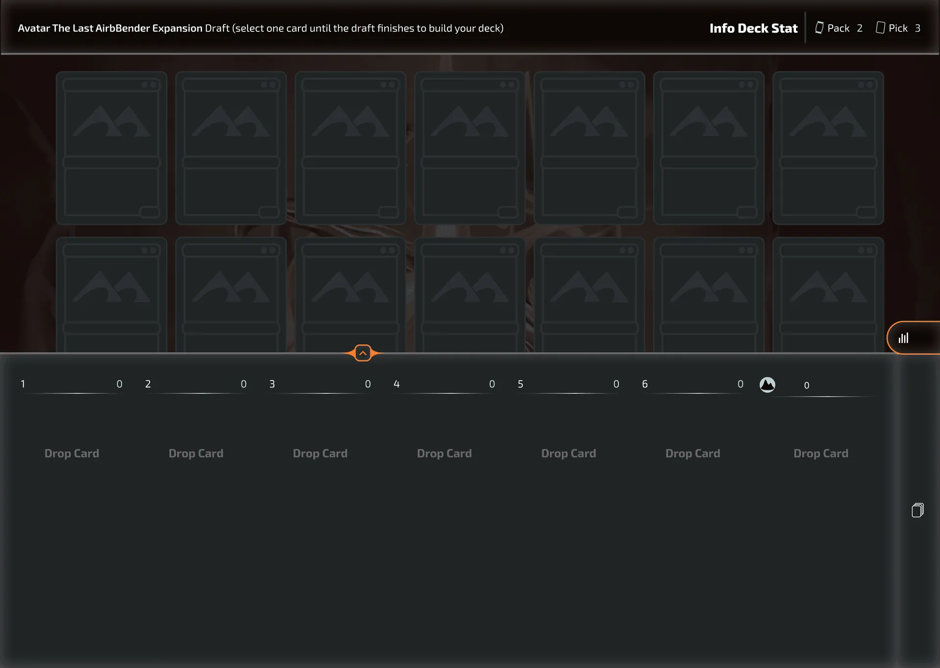
The core loop, see 15 cards, pick one, pack passes. Desktop shows the full card grid with pool stats sidebar, AI recommendations in cyan, player hover in orange, and a draggable deck panel at the bottom.
Mobile redesigns the interaction entirely, cards are larger for touch targets, the sidebar becomes a bottom sheet, and the deck panel scrolls horizontally instead of vertically.
Two completely different interaction models for the same action.
Interact with demo Draft/Loading/Screen

Sealed Mode
Pack opening and pool reveal. Desktop gives you the full cinematic pack opening experience with all cards visible at once. Mobile staggers the reveal, cards appear one at a time to preserve the drama of the open on a small screen. The pool reveal then sorts by color automatically on mobile instead of requiring manual filtering.

Interact with demo Sealed/Open

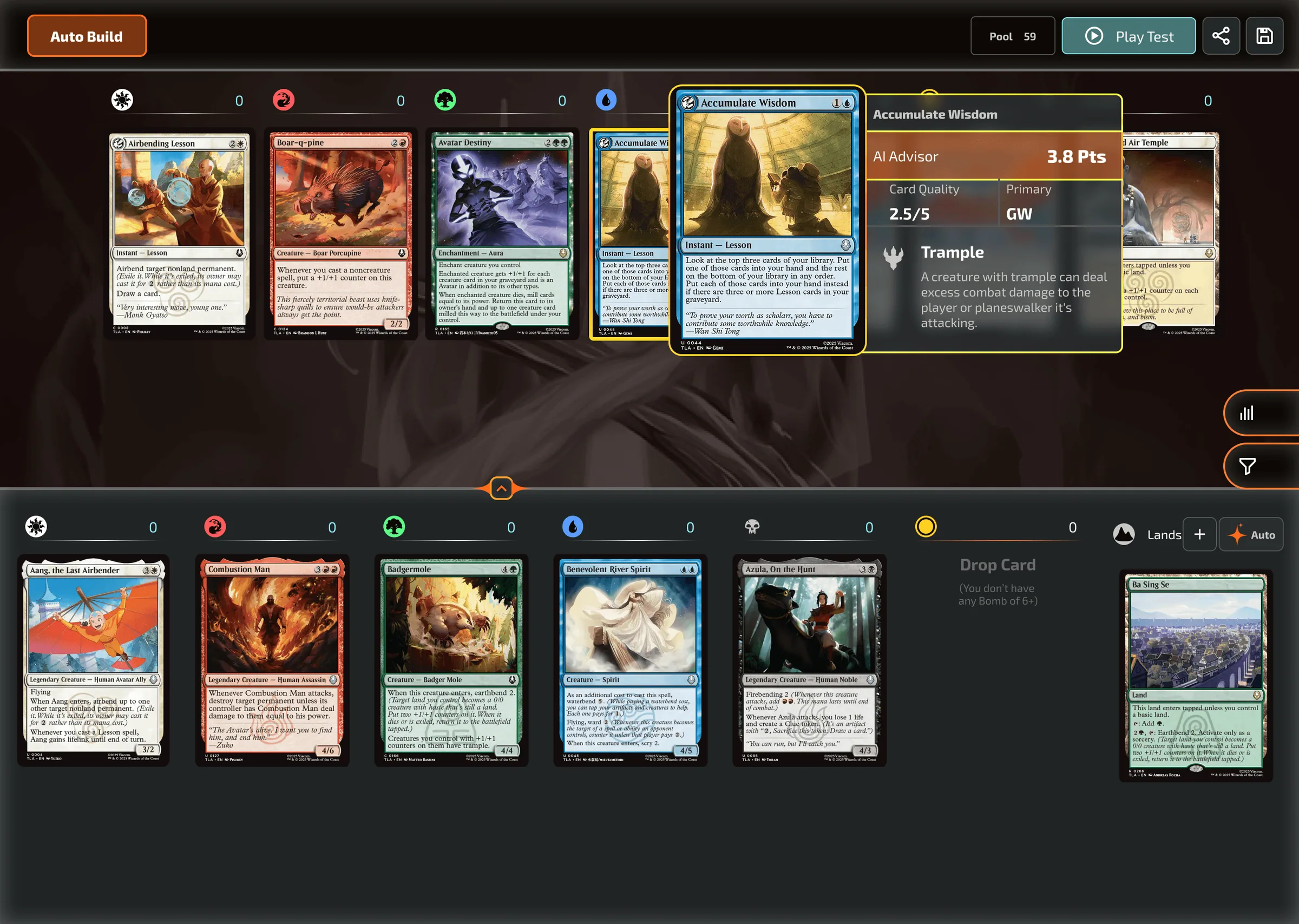
Deck Builder
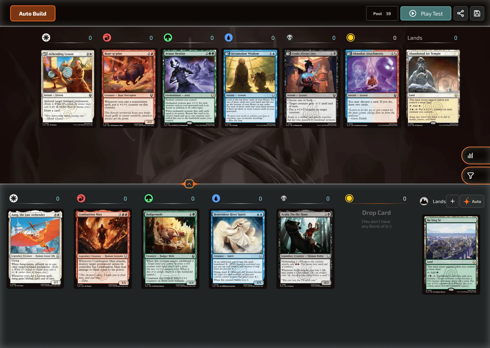
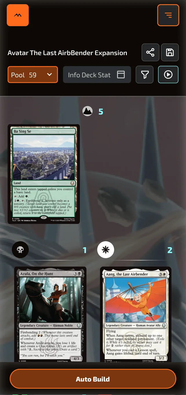
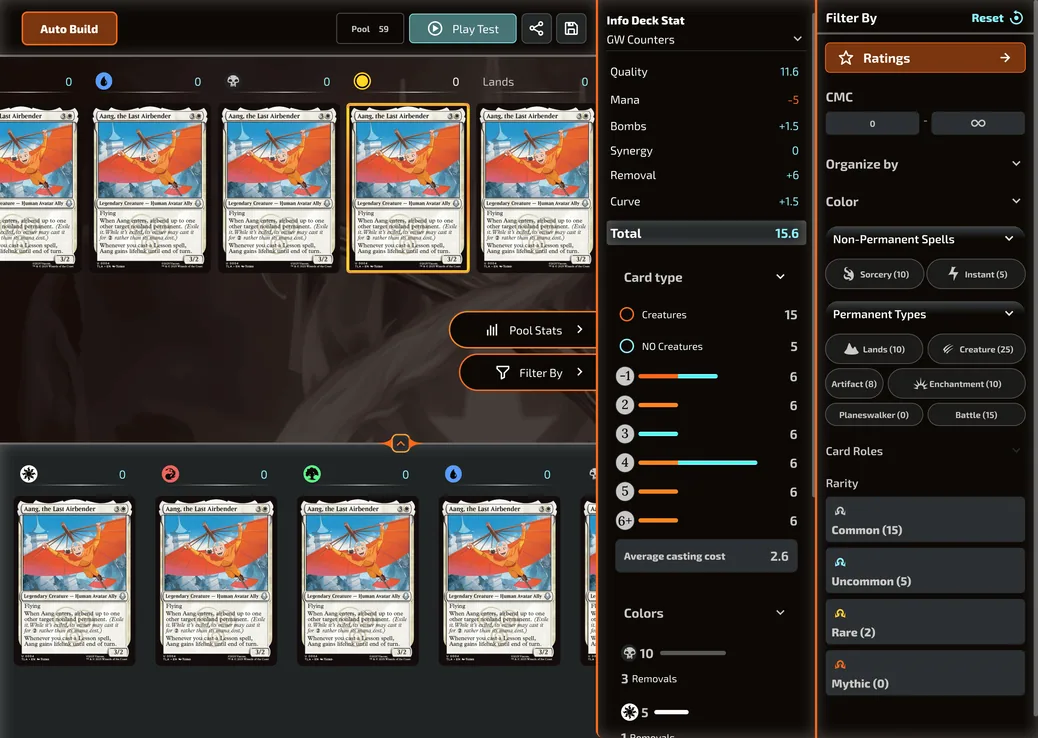
The most complex screen in the product. Desktop shows mana cost columns, color filters, pool stats, sideboard, and organize options simultaneously in a dense layout built for power users. Mobile simplifies to a single scrollable view with tab switching between pool, deck, and sideboard, hiding complexity behind progressive disclosure. A user on mobile doesn't need less power. They need it surfaced differently.
Interact with demo Build Deck/Default
WHAT SHIPPED
Phase 1 delivered to Turn Sideways Media
Homepage redesign
Full desktop and mobile, responsive specs included
Draft mode
Complete interaction flow from loading screen through card pick through pool stats
Sealed mode
Pack opening and pool reveal flow
Deck Builder
Full state coverage including filters, pool stats, compact menu, organize by mana cost, sideboard, drag interactions
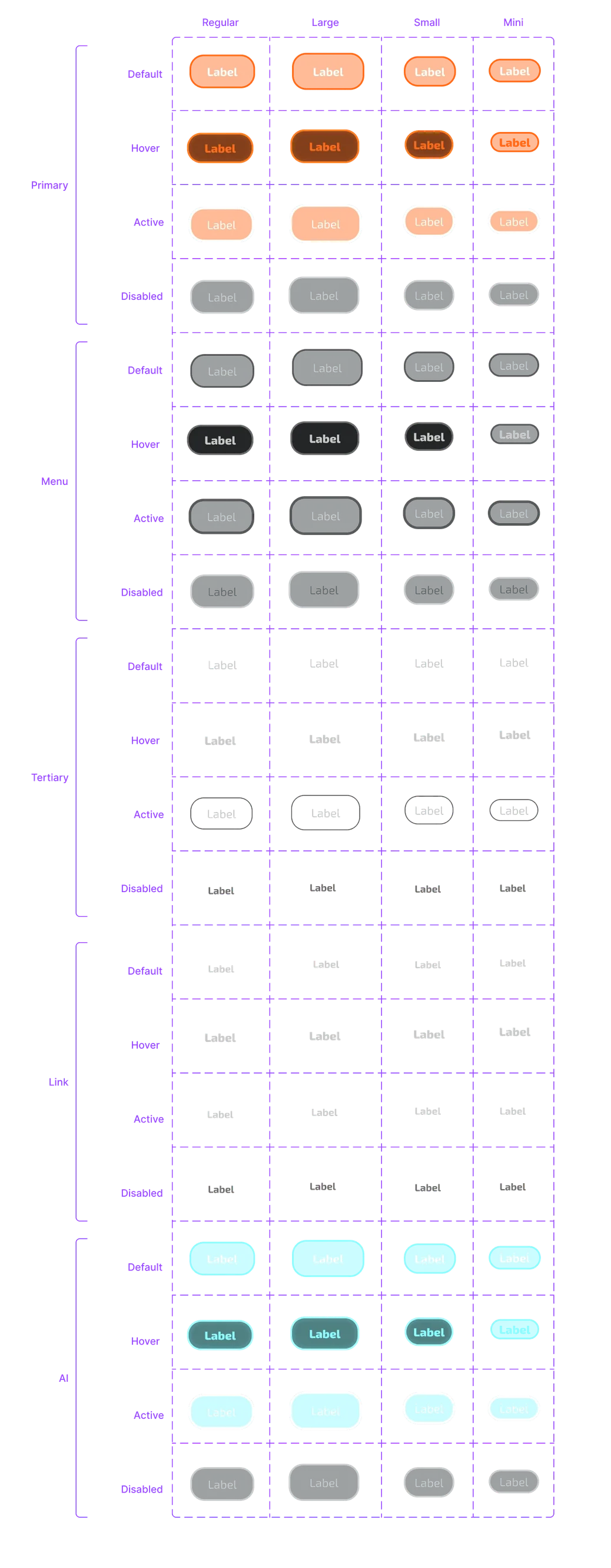
Component library
Cards, sidebar, building area, top bar, buttons, tooltips, dropdowns, all states documented
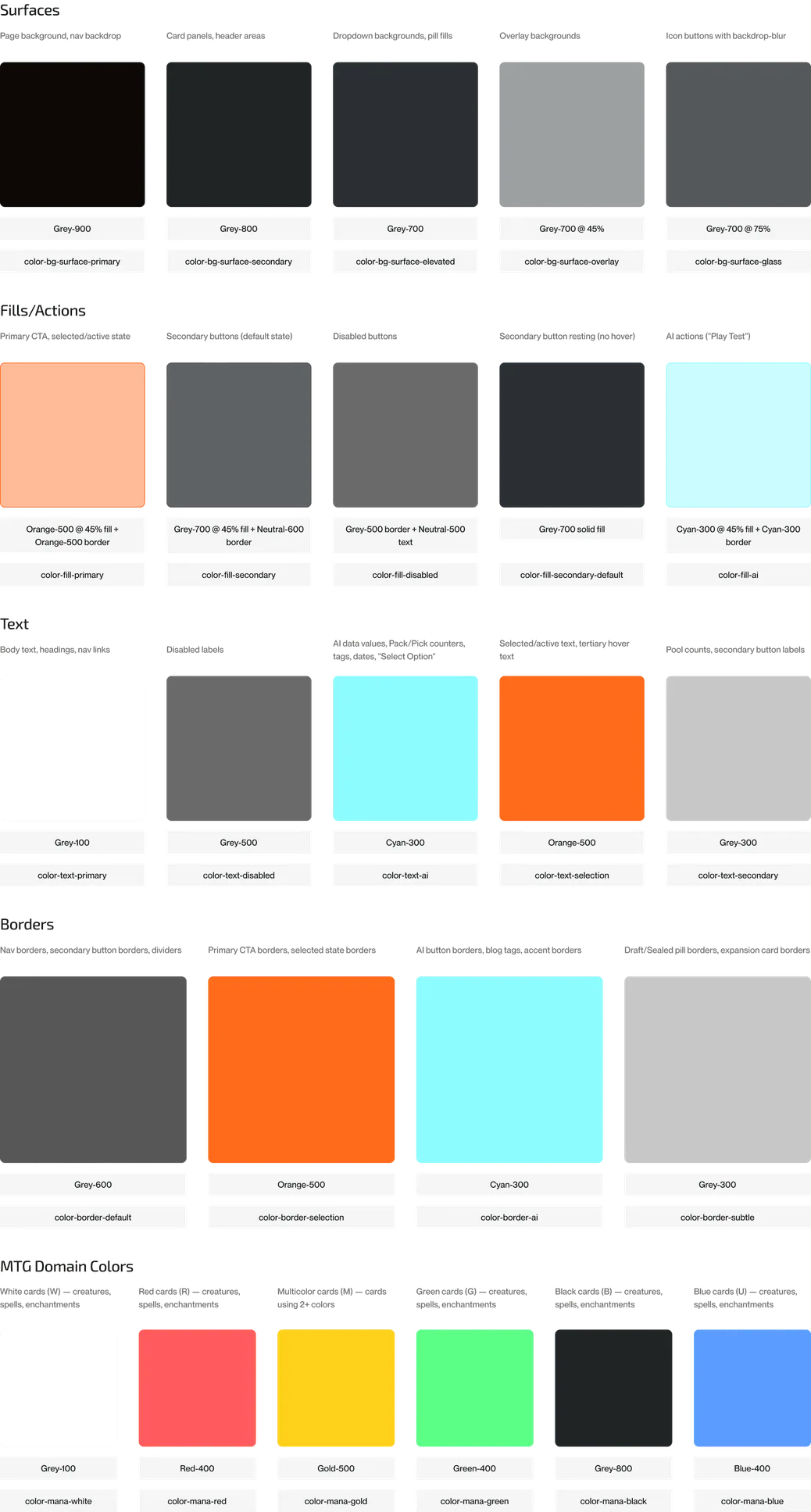
Design token system
Semantic color tokens, mana color tokens, effect tokens, all exported as CSS and JSON for direct WordPress implementation
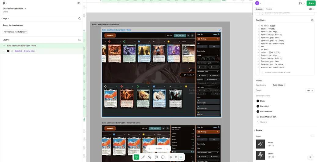
WordPress CSS override documentation
Implementation-ready specs for the dev team
What I'd Do Differently
Learn the product before you open Figma.
Three weeks of research before touching a canvas felt slow. It was the best decision I made on this project. Every screen I designed had a specific reason behind it rooted in how the game actually works. I now apply this to every project, the research phase is not optional, it's where the design decisions get made.
Test with the actual users, not just the client.
Phase 1 was delivered to the team and moved to implementation. I never sat with a Draftsim user during the process. The product has a loyal, opinionated community. One round of usability testing with real MTG players would have surfaced things no amount of competitor analysis could find.
Seed Phase 2 while Phase 1 is still warm.
The brand book and style guide were discussed but not contracted when Phase 1 wrapped. The best moment to scope the next phase is when the client has just seen work they're excited about, not weeks later. I now build the next scope conversation into every delivery.
Draftsim proved that the fastest way to design for a world you don't know is to actually live in it for a while. The domain knowledge wasn't context, it was the design.